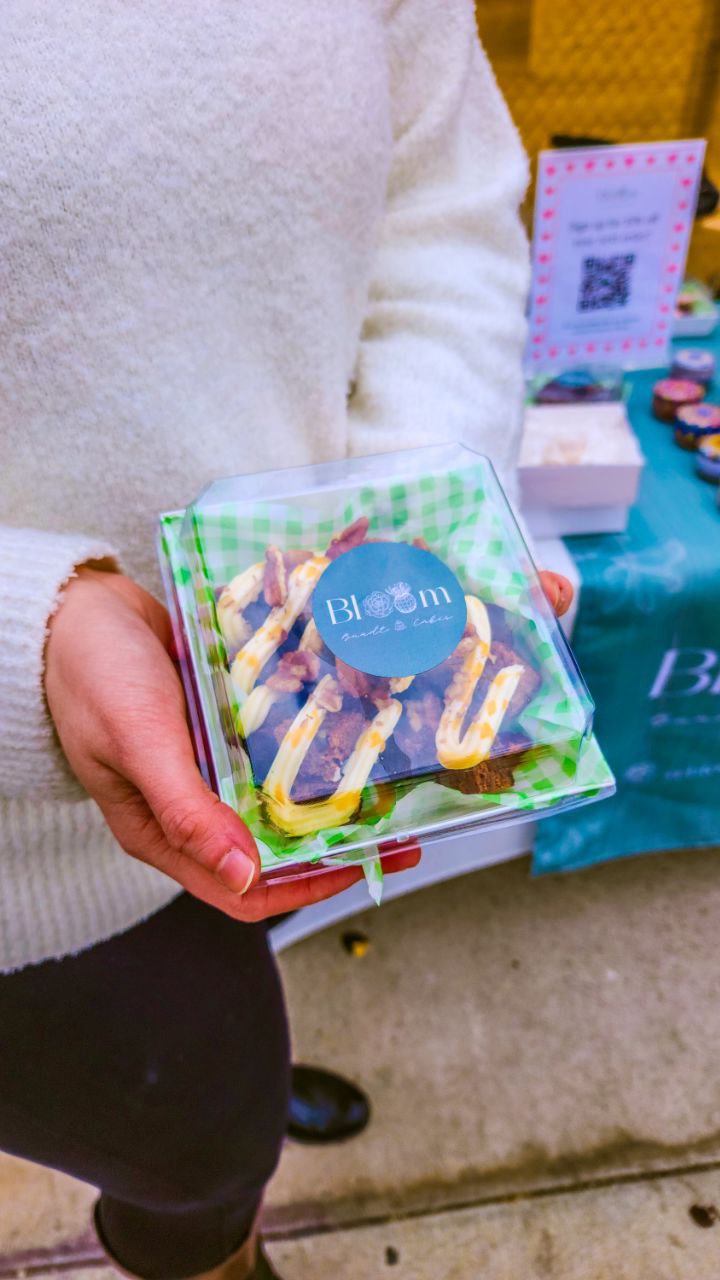
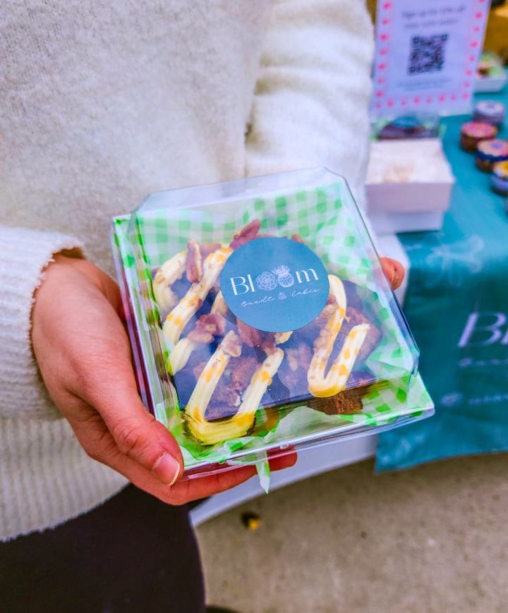
Bloom Bundt Cakes
I redesigned my own brand. Here's why ➡️
PORTFOLIO
The Challenge
In 2024, my husband and I embarked on a new adventure: we started a home bakery. With a background in brand design, I felt confident that my skills would help us build a lasting brand. But I soon realized that the food industry is a different ball game when it comes to branding.
In this case study, I'll walk you through our first brand and the process to the brand we have today.
Our First Brand Design
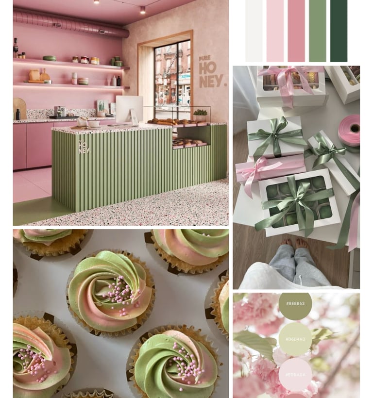
For any brand, highlighting unique attributes is important to standing out. When we started our bakery, my focus was to hone in on the organic ingredients we use, since that isn't something too common with custom cakes in our area. With my knowledge of color theory (at the time), I felt that a color pallet with a heavy focus on green would be a great choice for two reasons: (1) green screams organic, and (2) I wanted to bring in elements of the Arizona desert-scape to lean into the local feel of our business.
My initial design concept was meant to display clean ingredients, luxury, and the beauty of Arizona. And truly, I still love the brand itself, just not for a bakery.
At first, everything seemed to be going great, but after doing several markets, my husband and I began to realize something strange - people couldn't figure out what we were selling. We'd often have customers come up asking, "So what's this? What are you selling?" Several times, we had people ask if we were selling plants, and one woman even thought we were selling cakes with a certain kind of plant... It was clear that something needed to change.


The Process
Then one day, as I was on our business Instagram page, I noticed something so obvious and yet so subtle. Every one of the bakeries we followed for inspiration had one thing in common: pink logos. It seemed so small, and yet I couldn't help but think there must be something to it. Immediately, I began researching color theory for using pink specifically for bakeries. That was the moment I realized there was a huge gap in my knowledge of color theory in the food industry.
I found out that using the color pink makes potential customers view food as sweeter and better tasting than other foods, and pink also evokes emotions of comfort.
I began studying the brands of some of the bakeries I admire, and even looking at major companies like Dunkin' Donuts, gathering insight into how they leveraged the color and which ways they implemented it into their designs.
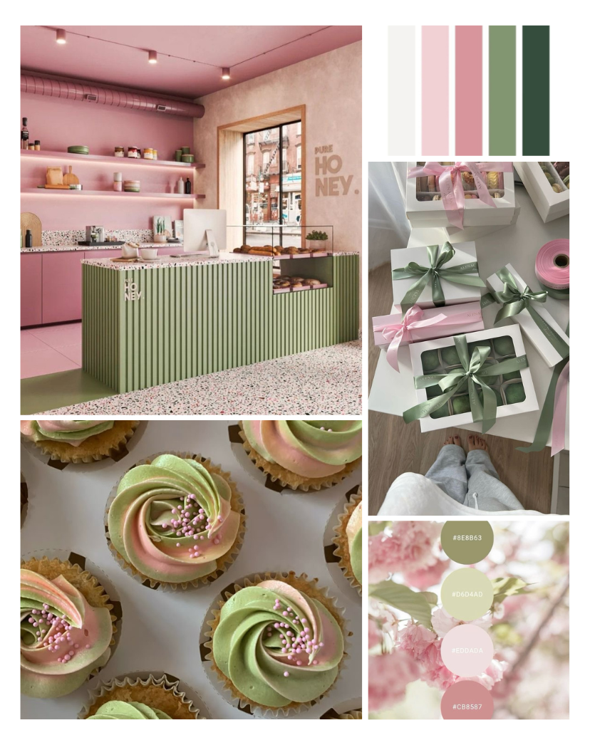
With so many pink bakeries around us, I wanted to incorporate the color into our own brand, but in a unique way. I also didn't want to leave green out entirely, because organic ingredients is a great selling point, and I wanted to convey that appropriately.
First, I wanted to update our logo - I realized that it had no cakes at all! Looking back, it's obvious that the initial design didn't seem too enticing for baked goods, but at the time I was really into the idea of showing our love of plants (which is probably why people thought we sold plants... 🤦♀️).
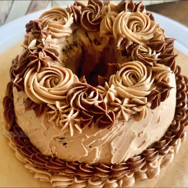
Because our cakes are so unique, I decided to show them off with our logo. I wanted to maintain the sketch style from the previous brand, so I took one of our bento cakes and used an online sketch generator to turn the cake into a usable PNG for a logo.
I also wanted to maintain the luxury feel of the fonts, but the ones I originally used just didn't vibe with the new sketch. I researched different font options and came up with a new pairing, and then I pieced together the new logo.
At first, I wanted to have a horizontal logo like before, but the more I tried out different versions, the more I liked the circle. Not only did having a circular logo help with social media profile pictures, it also brought a new dynamic to our brand, making it feel more modern and playful, with a touch of luxury.
Then came the moment I'd been looking forward to the most: swapping the color pallet.
Even though I knew I wanted pink to shine through our new branding, I didn't want to abandon the green color completely. Part of what makes our brand unique is the fact that we use organic ingredients in our cakes, and we don't use artificial dyes.
I began looking on Pinterest for inspiration of how pink and green can come work together harmoniously in a soft way. I didn't want to use loud or bold colors in the rebrand because I wanted the feel of quiet luxury to be a staple in how we represent our cakes.
I built a mood board of what I liked most and built a color pallet out of my favorite shades of green and pink, adding white and dark green for background and typography options.
For the logo, I decided to make the cake the star of the show and highlight it with a beautiful blush pink. This served to not only add pink to the brand in a very visible way, but also to make the cake stand out as the main character.
To incorporate the green, I highlighted the typography with a natural and more muted option to still evoke thoughts of organic and clean eating.
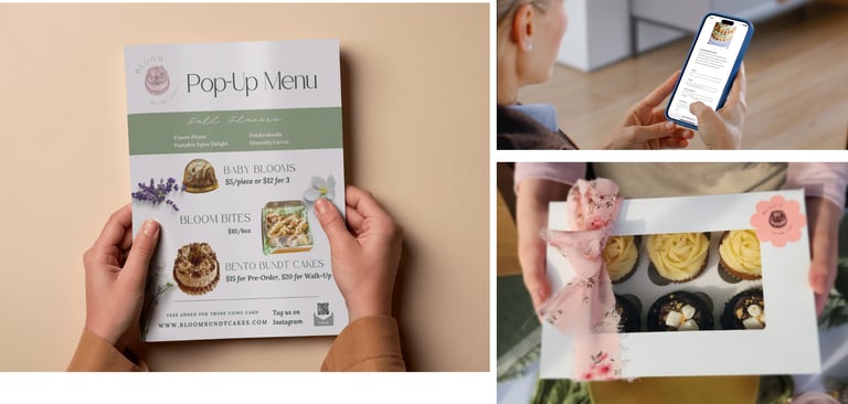
To finish everything off, I used the new logo and color pallet to create a complete voice for Bloom. No longer was our brand focused too heavily on organic and not on indulgence - our new voice took on a tone of playfulness and "guilt-free" indulgence. While still displaying the luxurious side of our brand, we were now able to convey the fullness of who we are as a bakery.

Lessons Learned
As a designer, I've learned to never stop growing. This project helped me expand my vision to see that color theory isn't just cut and dry, it is multi-faceted. Each industry has a unique way of showcasing their products effectively, and that might mean using color in ways another industry may not. I also learned the importance of understanding industry standards before trying to create something different. I initially jumped too quickly into designing a brand that was definitely not like other bakeries, but it ended up being too different. It's important to have a clear understanding of what works and what doesn't first, and then decide on how to stand out.