
Christ Embassy Charlotte
Refreshing a non-profit's brand to reach their desired audience.
PORTFOLIO
The Challenge
Christ Embassy Charlotte was established in 2012 as a local church that is part of a larger global ministry. Though the church was provided with branding guidelines, they requested help with a rebrand to make the branding more modern and aligned with the aesthetic of the surrounding city. The original brand assets they were originally given felt outdated and didn't speak to their target audience.
Constraints
Though I was working to refresh the brand, certain elements remained important. First was the motto "Giving lives a meaning," which is used on marketing materials and window decal. Second, it was important to the church to stay true to a color pallet centered around blue, which is used frequently for elements of the churches, but I did have freedom to choose secondary colors as I saw fit.
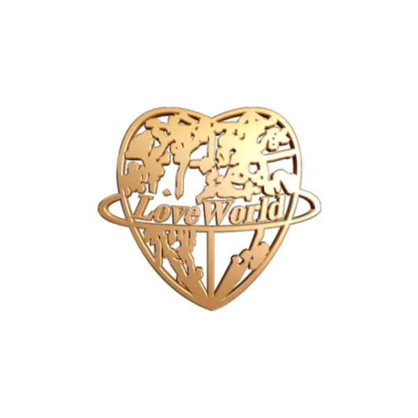
Pictured: former branding, focus on blue decor
The Process
Before designing the new logo, I first researched modern designs in the area to get a feel for the preferences of the church's target audience. I found that modern and clean design fit well for the city, especially as a financial hub for the nation.
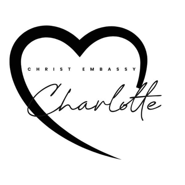
For the logo, I didn't want to remove the element of a heart entirely since the church is under the umbrella of Loveworld Inc., so I decided to do a more modern take on it. The church also wanted their name to be clearly seen in the logo because they were looking to establish a stronger presence in the community.
I drafted the initial logo up in black and white first, as pictured here.

Lessons Learned
Working on this rebrand helped me see the importance of designing with the target audience in mind. Though Loveworld Inc. has been established for many years, the "outdated" branding did not appeal to a younger, modern audience. By working on a redesign, the brand was able to speak to the intended audience much more effectively. I realized that sometimes it's necessary to step outside the box to make the best impression.

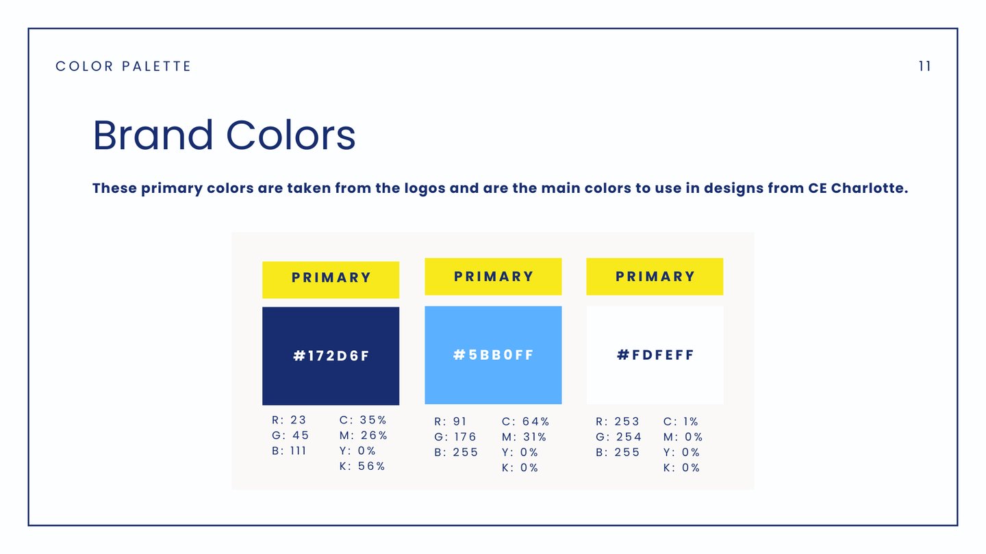
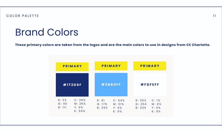
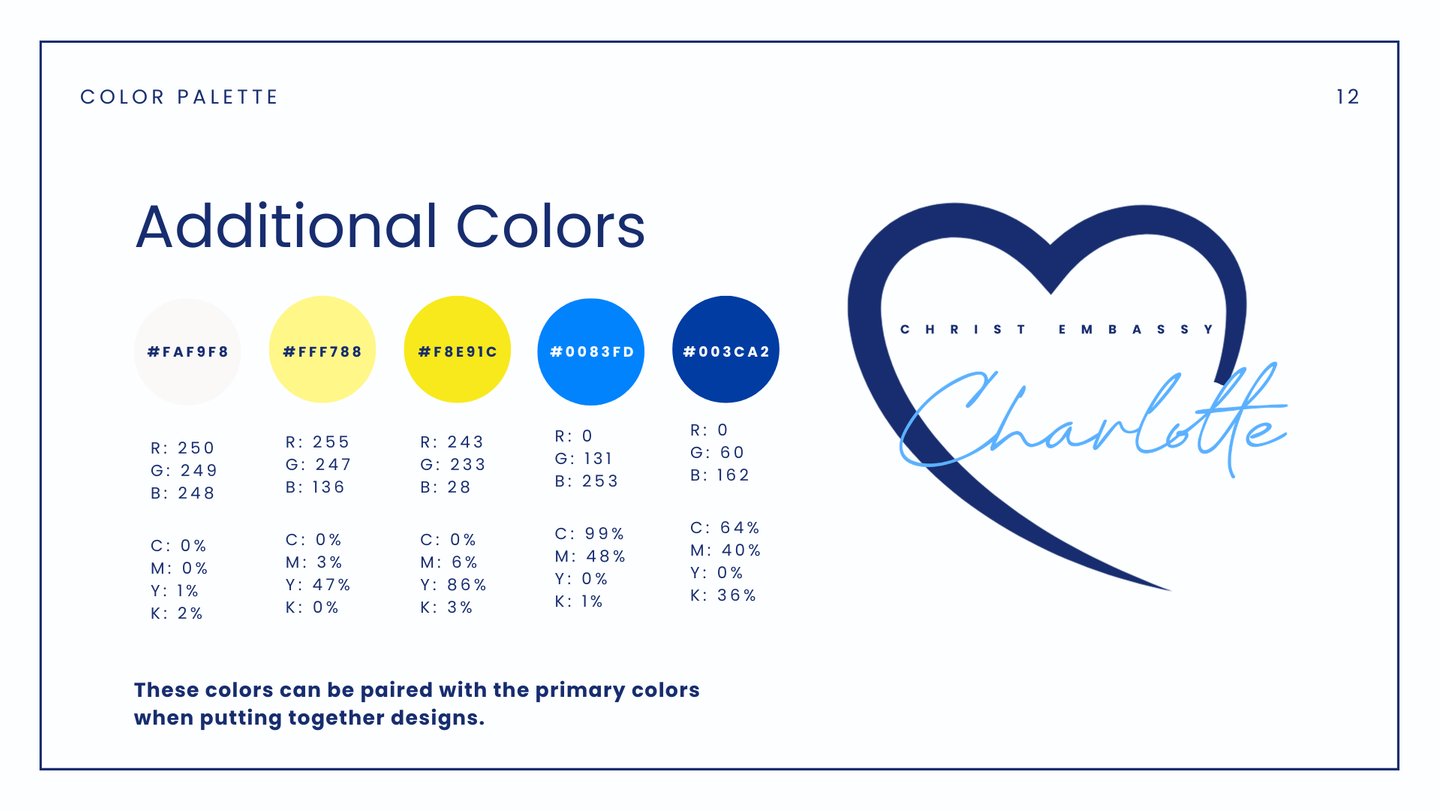
Then for the color pallet, I decided to focus in on the central theme of blue. Instead of mixing blue and gold as the primary colors, I chose a deep royal blue and paired it with a light sky blue, with black and white for typography and logo options. I did want to leave room for yellow gold accents as to not stray too far from the Loveworld brand, but I added the colors as secondary on the pallet.
Once the pallet was finalized, I applied it to the new logo, providing options for both light and dark backgrounds.
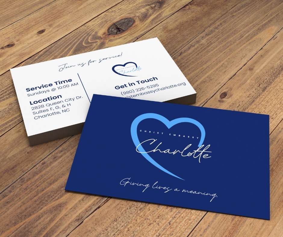
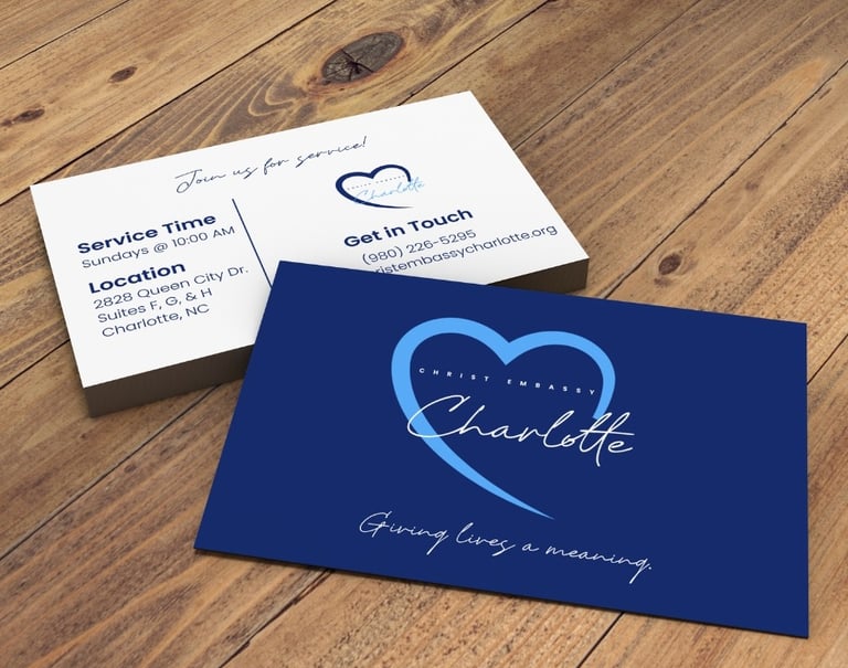
Finally, I designed marketing materials using the new branding so the church could begin reaching their target audience through events and street evangelism.
Pictured here are the business cards I curated to integrate the new brand and make it easy for church members and staff to share service information on-the-go. These cards helped the church grow because flyers were often thrown out due to being too large for most to carry when the church members handed them out.